Week #15 Blog Exercise - Interactions Between the 3 Levels

http://www.lunaparkproductions.net/services/graphic-design-cad-cam-3d.php 
Representation
This photo represents one of the fundamentals of Graphic Design. Through Graphic Design, we are able to digital manipulate images in order to send a message to our viewers. Here, we see that a guy is erasing himself with the Erase Tool. The impact it has its deep and mysterious as it gives off a sense of invincibility or loneliness. It relates to Abstract because its not giving away too much, but individuals are free to interpret the photos through how they see it. It may or may not have a deep message to it but it does have a unique style of showing how to deal with emotions. Therefore, it is abstract because its impossible to erase yourself through a Photoshop Tool or any kind of matter.This photo also relates to Symbolism through various ways. It can be a symbol of hiding, disappearance, alone, re-new and ending. All 3 Levels are shown in this example through a creative and unbelievable way.

http://vi.sualize.us/invertebra/cigarette/
Abstract
All 3 Levels show that California suffers through smoking issues and it makes people not want to live there. The impact on this design is able to tell people to stop smoking because it is making our environment look bad to others. This design is a great demonstration of Abstract art. Thus, there are no words to give out the central message of the design, yet we get a feeling of what it might be able. Even though it is a representation of California, it is in the shape of a cigarette which gives the image a twist. As for the Representational level of this image, California and it being a cigarette is represented. As we know, cigarettes are one of the leading causes of cancer and death. In addition, California can be represented as one of the few states that deals with smoking non-stop. The Symbolic Level in this photo is death, trashy, filth etc. This image is trying to communicate with people about how California deals with smoking issues and it makes our state intolerable to live in.

http://www.clker.com/clipart-11931.html
Symbolic
This design plays a role of being cautious or aware of danger that is near. The impact towards this image is that it helps individuals become alert when hazardous events or environments are in the area and prepares us to be adjusted to these things. The Symbolic Level of this photo is awareness, caution, danger, hazardous and stop.  The Abstract Level works will both factors because the color red usually means danger or a sense of stop/stillness. The exclamation point is a representation of surprise or alertness whereas the triangle is a representation of a road or environment that is dealing with an accident or hazardous situation. This is a well-know symbol that most people associate it with safety. All 3 Levels combine to make this design work for everyday life and to be aware of an individuals surroundings.

Week #14 Blog Exercise

http://englishbutlerartgallery.com/english/style/0409.jpg
Representational
The photo above is an example of Representational art for certain reasons. One being is that it shows the lifestyle of two individuals. In addition, it is realistic that people can live on a farm but we aren't really sure if these are actually people with identity or not. Another reason why it is an example of Representational art is the expression on the individuals' faces. Notice how they are not smiling and have steady postures which indicates that they have no emotion or they do not enjoy their lives. The lady isn't looking at the direction the man is which probably has to do with something that caught her eye or she doesn't like having her picture taken. The colors and tones of the objects in this photo is realistic such as the sky, the trees, the skin color of the individuals, etc. Lastly, the pitch-fork in the man's hand represents how he does some job of cleaning hay on a farm which also gives a clue of where the setting takes place.
http://www.caku-art.com/image-files/abstract-art.jpg
Abstract
This photo is an example of Abstract art because it not only doesn't give away the central message of the painting, but it also gives us an idea of what it could be. For example, we know that the music note at the top-left corner has to do something with the painting and the guitar on the right side of the painting tells us that. Also, there are 3 trumpets positioned differently for a reason. Maybe because if you look closely, you are able to see a face in the middle that is playing these trumpets. The colors being used in this piece makes its abstract because there is no consistency. Thus, it keeps changing to grab the viewer's attention and to show that music changes throughout certain tempos and feelings. Even though I was able to identify the guitar, music notes and trumpets, the overall shapes in this piece shows a beginning of the artist's main focus. In result, the artist's gave some clues to the viewers that it had to deal with music but in a way where it wasn't obvious by adding various shapes and colors to the mix.

http://newcriterion.com:81/cm/images/Image/im02.jpg

Symbolic
 I chose this piece as Symbolic because this artist (Yue Minjun) did a series of paintings and sculptures which had smiles on them which results in naming the series "The Symbolic Smile". In this piece, there are different areas which cover symbolism. For example, the men are colored red with horns on the top of their head which represents the same being as the devil or demons. In addithon, we know from tales that the devil is red and has horns on its head. What fascinates me the most is the smile on these men. We aren't sure if its a good thing or a bad thing that these men are smiling that way but it makes the piece most entertaining. The smile can be a symbol of various reasons. One being that they are having a good time or they did something bad to something/someone which made them laugh. In conclusion, asmile is a symbol of happiness and in this painting, they are happy about something but we aren't quite sure of what because there is not enough details supporting the meaning.

Design Is Dangerous, You Might Be Drinking It

Warning: Alcoholic Energy Drinks

                                                                                   (google images)


          The current controversy around Alcoholic energy drinks has been the cause of heart attacks, hospitalizations, and drunk teens to accidently kill themselves have all occurred because of these energy drinks’ faulty informational design. 
          At Ramapo College in Mahwah, N.J., the administration has banned the drink after the hospitalization of six students who drank multiple cans, according to the Associated Press. It seems for students that the opposites within the drink, caffeine and alcohol, attract and cause some serious consequences.
Brands like Joose, Four Loko, Tilt, Sparks, Max...


          What the drink is designed to do to the consumer is guided at your own risk, just like any responsibility when drinking other alcohol. However, when these alcoholic cans closely resemble any other energy drinks on the shelf, 
                                                          (google images)


at what point do you draw the line? With its bright and colorful image, these drinks are intentionally designed and marketed to inexperienced under aged drinkers.  It is then, that Design can be dangerous. It is dangerous because many people aren’t aware that these drinks are alcoholic. What makes it dangerous is not the 12% alcohol within each can. The human body’s natural reaction to alcohol is to get drowsy, which serves as protection from alcohol poisoning. The danger of these drinks is the caffeine, which allows the imbiber to stake awake and consume more alcohol than they would normally be able to. Its this lethal combination of ingredients that gets you intoxicated, but you feel like you’re okay, …unaware of the potential danger. While it is up to the drinker to be responsible and in good judgment, it is the drinks’ companies that should have a social responsibility to warn of the dangers if consumed. While they intentionally market their product in such a way that’s visually appealing, isn’t it ethical to include the facts within the visual design on the can? If companies don’t start changing their dangerous designs to inform, society will stay unaware and clueless if such dangerous designs go unnoticed. 
Think. Design. Inform.


Week #12 Blog Exercise - Visual Techniques

Aymmetry
Simplicity
Unity
Irregularity
Instability
Singularity
Realism
Predictability
Regularity
Activeness
Singularity


In my profession, I want to be able to digitally manipulate images with graphics to create album covers for various music artists. I always had a fascination of how an album cover can grab a person's attention without giving too much away and letting the viewer's interpret the piece in their own words. For the two designs I've posted above, I chose one of my favorite rock bands of all-time, The Starting Line and 2 of their album covers. In comparison, both designs have something that is realistic in them, for example: The first design has a tree, field and sky and in the second design, it has a girl talking on the telephone while sitting on a sofa. They are both simple designs which doesn't give too much information but it also makes its audience wonder what the album is going to be about. They both have unique forms of composition such as in the first design, the photo is flipped to make it look like the tree is on a wall or something and in the second design, the way the photo cuts off the sofa and focuses on the girl is a composition of Rule of Thirds. Also, they both have a representation of Singularity such as the one tree and the one girl. In contrast, the first design ... its not realistic for a tree to be in the position it is whereas the girl sitting on the sofa is possible. Therefore, the first design appears to be Irregular and the second design is Regular. In result, there aren't much in contrast between the two designs, however they do share a lot similarities in techniques.

Week #11 Blog Exercise - Contrast

http://vi.sualize.us/owakachangchang/graphic%20design/

The example above is a great demonstration of how contrast in color, shape and composition are successful in a design. We are given a hint that the text in red is a representation of blood by the way it goes across the wrist and down forming a puddle-like shape. In addition, the text that forms the blood are words that the person was hurt by which is another sign of pain.The color of the background gives a sense of sadness or mysterious vibe to the design which I thought was simple and clever. Also, the positions of the arm/hand looks like it is dead because the fingers are rested and not in a grip. The composition of this design works really well because if the arm was going vertical, it wouldn't make much sense for the puddle of the blood being there.

http://www.writingfordesigners.com/?p=2259

In this design, I found it to be a failed attempt to show contract for a couple of reasons. First, I am not sure what the white border is supposed to represent because at the top of it, it has a little tail of some sort but it doesn't really give me a hint of what it is. Another reason I found this to be a failed design is white tail seems to take up most of the upper side of the page which gives it a weird composition. Thus, there is no balance between the text and the background. Even though the color and shape of a heart in the letter "O" is representation of "love", the use of colors overall can be changed to give it a better contrast and harmony.

Week #10 Blog Exercise - Movement/Motion

http://current.com/technology/91256089_50-excellent-graphic-design-blogs.htm

In this design, motion is implied through various ways. For example, we know that when any liquid substance is running down a wall or some sort of flat surface, it creates trails. The color drops in this design show movement by seeing the different lengths of the tails of the droplets. In addition, the longer the tail is the further the droplet is going from the wall. Another indication of movement in this photo is that the droplets are overlapping each other. Thus, by creating new colors when mixing would had to be the action of crossing into each other which is a sign of movement. If you look closely in the photo, there are some colors that are lines that do not have a round bottom. This is because the droplet was either was traveling fast down the source or wasn't a big droplet to begin with. The direction the design is going is going down and we can tell because of the bottom of the droplets. It changes the depth of its roundness and the spatial area in this design is very tight and compact.

http://www.magicboxmedia.com/

In this photo, the perception of motion is easily detected. First, take a look at the childrens' head and where it is facing. In addition, they are looking at a certain area with amusement which is the random designs coming out of the ball. Depth plays a big role of indicating movement in this photo because starting from the ball, the lines and butterflies are really small and as they grow bigger, it gives the illusion of flying out of the ball. As we look at the bird, its wings is pointing down which can tell us that its flying and flapping its wings. Also in this photo, Implied Movement is used to lead the eye in the composition of the root coming out of the ball and how it curves various ways.

Week #9 Blog Exercise – Dimension/Depth/Space

http://www.flickr.com/photos/designrecipe/
Graphic Design includes the essentials of depth, scale & dimension to grab the viewer's attention and to convey a message. In this photo, we see that the text in the sand is standing at different levels. Although the words "FROM" "RUSH" & "HOUR" seems to be different scales because they are placed in various areas, I would assume they all would be relative to height if they were aligned side by side. The depth of each of the text creates the illusion of being farther and farther away from us when being closer to the horizon point. By observation, we use a combination of perceptual cues to figure out what the photo is trying to tell us. For example, there is a course of overlapping with the sand on the text, the texture gradient of the sand has depth and the atmospheric perceptive of a beach which connects to the text. We can depict what is real and what isn't in this photo because of the dimensions of the objects. Obviously, the hand holding the photo is a 3 dimensional object that is actually real whereas we see the texts as 2D objects because it only has 2 spatial areas.

Week #8 Blog Exercise - Tone and Color

http://thisisastupidblog.tumblr.com/

The photo above is a great example for my interest in Graphic Design. It has an equal balance between color and tone which gives the audience an idea of perception. The bears' faces have different tones to show that light is being cast from above. The different colors on the person's neck is a good example that distinguishes light and darkness. By going from a darker Hue and adding white to that Hue, it'll become more saturated and brighter. I love the various colors being used on the bears' faces because the orange and yellow colors gives me an idea or belief that sun rays are the source of light in the photo. The importance of tonal information in this picture is grateful because it gives the audiences a story with emotion. The hues of the person's hair/beard go from yellowish-brown to dark-brown which is a process of  tonal informational as well. If we were to give a sense of direction as a graphic designer or any type of artist, we would first take a hue and add its complimentary color. For example, in the persons' shirt, we know that it is red right (or some kind of red)? So, if we wanted the audience to know where light is coming from or just give shadows to the subject, we would add green to the red. By doing this, it will desaturate and become darker. I remember doing this for my Color class last semester and it really helped me experiment with colors. In addition, I learned various ways of obtaining certain colors without having to go out to the store and buying them. Colors and Tones are important for any kind of medium because it grabs the persons attention and feelings. That's how I was drawn to this photo :)

Week #7 Blog Exericise - Graphic Design


MOVEMENT
From the picture above, we can see that the element of Movement is present through various reasons. First, the angle of the ropes from the fingers to the seat shows that the swing is in motion. If the ropes were going straight downward, we would assume its not in motion. Another notion that this design gives us a sense of movement is the way the person's hair is. The person's hair is going in front of their face which tells us that the person is swinging back up to gain momentum. Finally, we see how the person is leaning forward which also tells us that they are going backwards. Thus, these are components of "felt axis" where a subject is either going up-down or left-right.Even though we don't have additional framework to tell us that this photo is in motion, our eyes scan the design to find areas that helps us be aware of movement which I have listed.

http://www.flickr.com/photos/brentcouchman/4832655221/

SHAPES
In this design, the element of Shapes is used repeatedly. The designer has duplicated numbers amounts of bikes to form one big circle. In addition, the bikes look like its going in a circle because of the way the outside bikes are placed. In the bikes alone, we can see shapes such as triangles, circles, rhombuses, stars, lines, etc. As the design forms a circle, it seems like there isn't an end point and it keeps going and going. The style of triangles that are formed by the bike frames and tires causes tension and clutterness. Therefore, the designer's mission was to show the different shapes you can form with bikes by putting them close together. I love this design because I am a biker myself and when I look at this photo, I feel like the all the bikes form one wheel. Thus, the message from this design is "keep going and going" because it seems endless and looks like its rotating.

http://www.stumbleupon.com/stumbler/alana13/tag/movies/10/
Color
In the photo above, the element of Color is shown to depicted certain phases of the subject. For example, cool and vibrant Hues are used to give the picture a certain feeling/mood of sickness or some sort of troubled state. Also, the designer used complementary colors of Blue-Green for shadows which show direction of where the light is coming from. The photo shows different areas of saturation such as the 2 phase of the person and so on. In addition, the person starts to look more dull and starts to drift towards a grayish color tone. As the subject starts to come closer to the frame, it comes darker and easier to see whereas when you see the subject in the far back, it looks more brighter and blurry. I love the colors the designer used for this picture because it gives a relaxing and calm vibe to it but from the look of the subject, I can tell it represents illness.

Week #6 Blog Exercise - Design Success and Failure in Relation to Syntactical Guidelines

Credit of photo: http://www.herecomesthefuzz.com/designvic/

I chose this design because my major/interest revolves around Visual Communications. I want to create posters, CD cover art and other graphical art for all-kinds of musicians, especially rock. The photo I chose has various Syntactical Guidelines. For example, the words being used are lyrics, song titles and descriptions of James Brown which develop a perception of him singing. We aren't entitled to know that its James Brown until we see the the infamous James Brown hair and his teeth which connects together to form a head. This design is also well-balanced because certain phrases or words illustrate his facial features, but with his head being tilted, it gives a sense of imbalance. There is stress going on with the photo where the words in the background are diagonal but it is attention-grabbing because it creates a sort of glow or aura around James Brown. The Syntactical Guidelines work well with this design because the wording is grouped precisely  and will attract users who are interested in James Brown.

Credit of photo: http://www.youthedesigner.com/wp-content/uploads/2008/05/graphic-design-portfolio-chuck-anderson3.jpg


This design I chose does not work with the Syntactical Guidelines. I couldn't get the message when looking at this photo because there was a lot of things going on. For example, there are mountains, I'm not sure what the design overlapping the mountains is, the sun is not that visible on the right-hand side, there is a curve over the hills which I am guessing is a temperature gauge, etc. The design isn't balanced because there are various shapes that don't work well with others which creates a lot of stress. Also, its not leveled because I feel most of the weight is being shifted to the left side of the page which creates a more sharpening effect. The only pattern I found that are grouped is the mountains, other than that I feel the designer just started putting random objects to fill in the picture. When looking at this photo a couple of times, I developed the message of "night life adventure" because of the colors being used and how its neon which represent partying. Furthermore, this design was unclear and hard to breakdown for me.

Week #5 Blog Exercise - Visual vs Symbolic Language

Credit of photo: http://www.12news.us/unemployment-extension-june-30-2010.html

Unemployed
Denied
Desperate
Planned
Opportunity
Society
Economy
Future
Successful
Struggle
Life

Symbols:
Powerless
Hope
Labor
America
Opportunity
Limited

The photograph above displays a man holding a sign with his professional accomplishments, but is looking for a way to earn food because he is unemployed. As you can see, he is standing in a certain spot of a city where people are most likely to see his message. This pictures represent how the economy is not providing individuals, especially successful individuals, jobs who are struggling to not only feed themselves but their families as well. The man in the photo looks tired and hopeless from standing all day, trying to look for some kind of labor. He mentions that he is has a PhD and other accomplishments which might give workers a second look at how bad the economy is. A possible replacement for this photo can be the power of the economy. No matter what the academic status of person holds, jobs are harder to get for anyone. By looking at this photo, it is visually telling us that power is in the hold of the government and the economy is plummeting.

Week #4 Blog Exercise - Visual Thinking Research

Photos by: Me (Anthony Buada)

For this week's assignment, our visual thinking is put to the test. Me and my friend Paul chose 2 puzzles that popped out to us the most among the other puzzles. The first puzzle is called The Cat. In this puzzle, you are asked to find as many triangles as you possibly can in the cat design. According to McKim's Images in Action reading, I have used the pattern-seeking method to find certain triangles. In the tail, I saw that little triangles and the semi-big triangles combined formed one triangle. However, I wasn't aware that some of the triangles in the tail wasn't triangles at all which I used pattern-completion to identify this mistake. In addition, I skipped the triangle were full-triangles and counted because of visual memory. In my head, I have kept a photographic memory of what I have went over already and what wasn't familiar the other times I counted. Furthermore, to get my final answer, I categorized the cat in bits and pieces. I knew that the cat's face equaled 10 triangles totaled, the body equaled 3 triangles totaled and the tail equaled 7 triangles totaled. When Paul and I first finished the puzzle, we had different results from each other. We both counted the triangles we found together and understood what we missed. After going through the puzzle a couple of times, we finally had the same results.

In the next puzzle, we were given the task to name the month which the symbols illustrated. For the both of us, we solved the puzzle without various guesses than we did for the cat puzzle. At first I didn't get any sense of what the symbols formed, but I looked at the puzzle from another viewpoint. I had a sense that I was looking at the puzzle too close so I aimed the paper further away from my sight. I then began to see a word from the symbols. In addition, the spatial analogy between the symbols helped me see the words clearer and I figured out the answer. As for Paul, he cut the symbols in half and found the answer (as you can see in the photo). We both used different visual thinking methods to find the solution to the puzzle but ended up with the same answer.

Week #3 Blog Exercise - Feature Hierarchy and Visual Search


Credit for photo: http://en.wikipedia.org/wiki/Visual_search#Feature_search

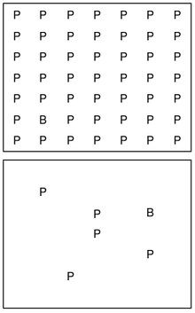
By looking at the photos above, were you able to spot the letter "B" without struggle? If so, that's very impressive! This is because we use "feature channels" which determine what we are looking for such as shape, color, depth, motion and spatial layout. Our eye movement is planning what we need to look for and eliminates what we already know about the object. Feature Hierarchy and Visual Search are much similar in many ways. For example, Feature Hierarchy uses "the pop-out effect" which points out certain areas on the object and Visual Search uses levels to depict what you are looking at in different orders. In addition, we are aware of what is familiar and what isn't to us when overlooking something or someone. If I were to view the photos above without knowing what to look for, I would assume nothing is wrong with it. Although, with brief seconds of scanning the pictures up and down, I would spot the letter "B". As my eyes became fixated on the different shape in the first photo, I was preattentive on what to look for in the second photo. An application I would want to design for would be album covers. I was always fascinated by how abstract and creative some albums are which lead me into becoming a Visual Communications major. In addition, album covers show the audience what the record is about through illustrations and photos that grab their attention.

Week #2 Blog Exercise - Top-Down Visual Processing

Credit for photo: http://www.theotherpages.org/spy/spy-cat4.html

Top-Down processing is essential in our daily lives when looking for a certain object or person. For example, the photo I posted is a game called "I Spy" where one person thinks of an object in their head and the other person tries to guess which object it is. The person first starts off by saying "I spy with my little eye, something __(red)___". Then, the seeker uses goal-direct eye movement and distinguishes objects that are red such as the bubble blower, sunglasses, the letter block, etc. Furthermore, the seeker has narrowed their options down and has fewer guesses to make. If I were to be the seeker, I would look at the entire photo and then look straight for the objects in red. If I were to guess a certain shape, I would do the same and look for a specific shape, etc. Our eyes are fixated on an object for a second until we have more details and hints of what we are looking for. Once we know what we are looking for, the surroundings become unimportant and blur.

My review


To be creative, you have to see things in different way. This class teach me just how to do that and its actually kind of fun. It ease and open up your mind. I cant wait for our next assignment =)

Random

Random quote using a picture of chili and the word love.


You spice up my life with your love. Just like the color of chili, your love remains and never fade. I love you and our love will keep on burning like a red chili.

Anology

Anology are divided to two, metaphor and simile. What is anology through metaphor? It means comparison that are not obvious. and what is analogy through simile? It means define something or subject using different word that we still can understand immediately.

Lost

I never knew that juxtaposition are used widely. In our work and daily life. Miss Tasya showed us all the juxtaposition that were used in the tv series called "Lost". Here a few juxtaposition in "Lost" by Miss Tasya :

“Lost” Season 1

Success/Failure - In his past, Jack's refusal to give up on Beth in the OR where unsuccessful, but when he refused to give up on Charlie he was successful with CPR. ("All the Best Cowboys Have Daddy Issues")

Lucky/Unlucky - Hurley and Walt play backgammon, where Walt is lucky to get the rolls he wanted each time and Hurley is unlucky, getting rolls that caused him to lose. ("All the Best Cowboys Have Daddy Issues")

Help/Hindrance - Charlie's bid to save Claire from Ethan ended up hindering the survivors as it prevented them from getting their answers. ("Homecoming")

Anger/Brokenness - In flashback, Locke is shown very angry and hitting his car. The scene switches to Locke in the jungle, kneeling and crying at the Hatch, seemingly broken. This is a juxtaposition of anger and sadness. ("Deus Ex Machina")

Brokeness/Hope - Directly after the moment described above, a light comes on in the Hatch, reinvigorating Locke's hopes and faith in the Island (and his destiny).

Life/Death - Boone dies at the same time Claire gives birth to Aaron, showing a juxtaposition of life and death with a strong contrast between the two. ("Do No Harm")


Juxtapositon

What is Juxtaposition? From my understanding, juxtaposition is looking at the same thing from two opposite points. For example, like what miss Tasya used, the word order and chaos to an image of a soup and stack of carrot, we can apply both word to each picture and its still acceptable.

Associated mind map

What is associated mind map? Basically, its a mind map that we branch out from a logical mind map. Associated mind map help us create new idea.

Mortar and Pestle


Mr. Radzi asked us to create something new from associate mind map using mortar and pestle. i used hair as the associated word, and create a hair straightener.

Logical mind map


Logical mind map are connected to stereotype. what is stereotype? STEREOTYPE is thinking the the box or in other words typical thinking. The most commons stereotype thinking is about men and women. people who are stereotype will define men as strong and women as weak. However, the fact is we are all the same. we our self define whether we are strong or weak.

Mindmap!

Today, we learn about mind map, a creative mind map in fact. Creative mind are divided to two, logical mind map and associated mind map. Here a few example of creative mind map. logical mind map is connected or related to stereotype. Meanwhile, associated mind map generates random words.


Innovation and Invention

What is innovation? Innovation is something that can be innovate, something that can be improve and remodel. Invention is to me, a new outcome.

Creativity

Being creative is all about thinking the other way. To me sometimes even a simple thing can be great with just a touch of creativity. We can be creative no matter what our profession or direction are. To me even war can be creative, that is why we call the art of war. so here are a few of art piece that i like.